

TEAM
Product Designer (me, sole designer) + 3 engineers
MY ROLE
Product Strategy, UX/UI Design, User Research, User Flow, Information Architecture, Design System, Prototyping, Design QA, Engineering Handoff
TIMELINE
2026 – Present
(MVP & iteration)
Project Overview
LOVO Tails pairs an at-home urine test kit with a mobile app. Owners log repeated readings, build a baseline for their own pet, watch how things change over time, and organize it all into a summary they can share with a vet.
The product is deliberately non-diagnostic. It never claims to diagnose or replace a vet. My job was to make clinical-looking information understandable to an everyday owner without ever making a medical claim.
I owned the whole experience. Research, product logic, IA, UX/UI, design system, prototyping, usability testing, iteration. And I ran an AI-augmented workflow the whole way through to move fast without giving up design judgment.
THE CHALLENGE
THE GOAL
Design Process
Research
EMPATHIZE
USER INTERVIEWS
Owners notice changes but can't tell what matters.
They see small things. A color shift, a behavior change. But they can't tell if it's meaningful, when it started, or what to do. The data existed. There was just no interface that turned it into something an owner could read, trust, and act on.
KEY QUESTIONS
How do owners notice and track changes today?
What makes a change hard to spot or hard to time?
What would they actually want to bring to a vet?
FOUND
Change is hard to see, harder to time
Anxiety with no next step
Medical framing doesn't land
Owners caught problems late and couldn't remember when they started.
The uncertainty itself was the pain. Owners rarely knew what to do about what they noticed.
User Persona


People wanted plain meaning, not clinical readouts to decode.
Points of View
How Might We
Product Goals
Anxious owners need to know if a change matters for their own pet, not a generic range.
Everyday caregivers need plain meaning, not medical terms to interpret.
Owners prepping for a vet visit need their observations organized into something they can hand over.
Turn repeated readings into a personal baseline an owner reads at a glance?
Communicate status honestly and calmly without making medical claims?
Bridge the at-home experience and the vet conversation so nothing gets lost?




Reduce the time required to find relevant scripture citations.
Improve search clarity through filters, scalable results, and visual hierarchy.
Create a modern, focused interface that supports long study sessions.
Ensure the system remains accurate, reliable, and scalable across a large dataset.
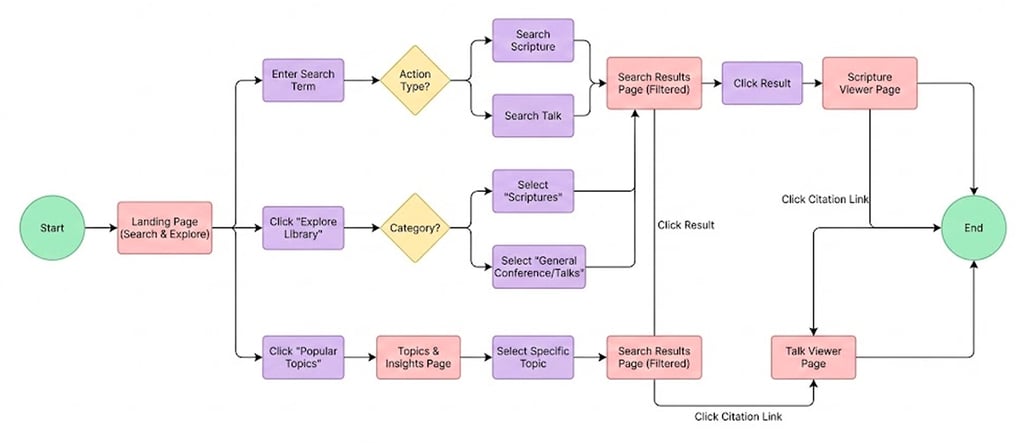
User Flow
The core flow takes an owner from a physical test to a digital understanding. Collect the sample, read the strip, match the pads, enter results, see it against the pet's own baseline, build toward a shareable vet summary.
Low - Mid Fidelity Wireframes
I started with low- to mid-fidelity wireframes to test layout and navigation changes based on insights from user interviews. The goal was to simplify the search flow, reduce cognitive load, and help users find relevant citations faster.
Branding
High Fidelity Prototype
Usability Testing
Results
100%
Task Completion
3 X
Faster Search Time
4.7/5.0
Engagement Score
User Feedback & Iteration
During usability testing, Several users noted that while keyword search was powerful, it would be helpful to browse scriptures and citations by topic when they were exploring questions rather than looking for a specific verse.
To address this feedback, I introduced a topic-based browsing experience that complements keyword search.
This new page organizes scripture citations around common gospel questions and themes, allowing users to explore content more intuitively and discover connections without needing precise search terms.
I often begin my study with a general idea rather than a precise term. Being able to explore by topic would make it easier to learn and see how different scriptures connect.”
When I’m studying, I don’t always have a specific verse in mind. I want a way to browse by topic or question and then narrow things down as I learn more.”
"
"
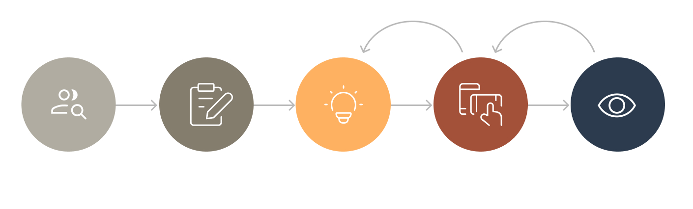
EMPATHIZE
DEFINE
IDEATE
PROTOTYPE
TEST
ITERATE
ITERATE
UX/UI Design
TOOLS
Figma, Figma MCP, Claude Code, Claude Design, React Native
I interviewed 5 pet owners before committing to a direction.
Help an ordinary owner log readings with confidence, understand what those readings mean for their own pet over time, and walk into a vet visit with a clear summary. All in plain language, never diagnostic.
Emily is the owner LOVO is built for. She pays close attention to her Cavapoo, Charlie, and picks up on small shifts fast. What she lacks is a way to tell whether a change is meaningful or just a one-off, so worry builds with nowhere to go.
She anchored the core product decision: a baseline built from Charlie's own readings, so Emily can see whether a change is unusual for her pet rather than against a generic range. Her need to feel confident about when to monitor versus act became the through-line for the whole experience.
Reframe the product from "log a strip" to "understand change over time."
Keep every statement observational.
Make the home reading-to-baseline-to-pattern-to-vet summary one legible flow.
From Design to Build
Designing with implementation in mind
I implemented key front-end flows using React and JavaScript to ensure the tested experience matched the shipped experience.
By translating UX decisions directly into code, I preserved search clarity, performance, and interaction intent—without handoff loss or late-stage compromises.
Web Development
What I Built
Core search and filter interactions in React
Dynamic rendering for citation-heavy results
Reusable UI components aligned with the design system
Responsive layouts optimized for performance
Owning both design and front-end allowed the product to move faster, iterate with confidence, and ship with fewer assumptions. I design for real systems—not just screens.
Why This Matters
SKY SONG
Contact
haneulisstudying@gmail.com
385) 307 6810